Dashboard - Project wiki / confluence practice
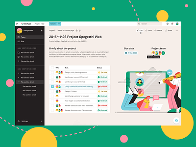


I wanted to practice creating a dashboard that included a lot of content and supportive actions that pushed me towards making the best use of the space available.
To achieve a balanced and easy reading experience, I used a 4px baseline grid to space out everything very tightly.
I had a big focus on ensuring that all text/colours are accessible and all content presented can still be clearly read.
Lastly, I've included a range of hover states such as the secondary edit button hover states and tooltip on team member's name.
illustration by pikisuperstar / Freepik