State Opera and Ballet
STATE OPERA AND BALLET - IDENTITY DESIGN
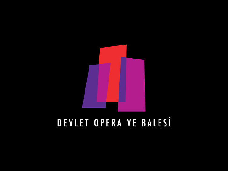
The corporate identity design in this set involves the design of the logo, the letterhead and the admission ticket of the institution. I wanted to create a feeling of a theatrical space with these three quadrilateral shapes. The quadrilateral shapes are used in different sizes to create a three-dimensional effect and the colours on the intersections of the shapes were changed to create an illusion of transparency referring to the modular structure of the theatrical stage.
The variations of purple, red and violet colors are used to give a romantic feeling. For the ticket and business card, the logo is applied on a black background to give it an elegant touch.
More by Cenk Başbolat View profile
Like
