Industrial Electronic Supply logo quick fix acronym
#3 of my personal project where I take bad logos I see around town and fix em up super quick. No strategy, no research, just cliche or a clever idea (if I'm lucky).
I didn't have an idea when I started this one so I simply started experimenting with type and spacing. Quickly, I realized that there was the potential to use a perfect 3x10 grid for spacing within the main logo. This also inspired me to go for a mid-century, classic corporate branding look. I love that era of design and tend to design that way anyway.
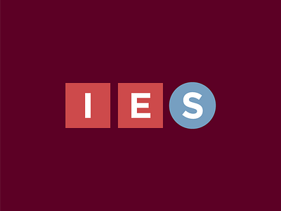
This is the first logo quick fix in which I've decided to also include a variant. In this case, an acronym. Normally, I hate acronyms. But I hate ridiculously long business names even more. So, here we are.
Full write up here: https://medium.com/@russellwadlin/how-to-make-a-better-logo-3-industrial-electronic-supply-inc-d78e784213ed?sk=ccaf8f3fd0795d0459e703a121032da6