Flection - Work-Focused Journaling
Flection is a tool to coach yourself up through work-focused journaling.
Establishing the branding for the project was a lot of fun. Since it is a web application and after looking at the competition out there, I landed on yellow as our primary color. I think yellow is a pretty underutilized color and therefore it stands out quite a bit.
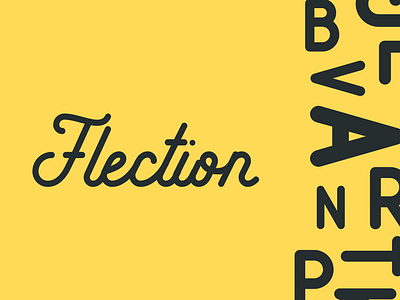
For the logo, we have a pretty modern, minimalist design to the app, so I love the contrast of that with the script logo. Also, playing into the idea that Flection is all about writing and reflection, the handwritten look of a script logo felt good.
I also liked using letters and typography as the main design element. Again playing on the amount of writing involved with the app.
The app has a very minimalistic design. Lots of white and grey. The reason being we wanted the user's content and reflections to shine through. The advantage of using yellow as well is that I can utilize to just add a pop of color here and there. It helps maintain the brand but also doesn't take over the screen.
Let me know what you think! I’d love the feedback
