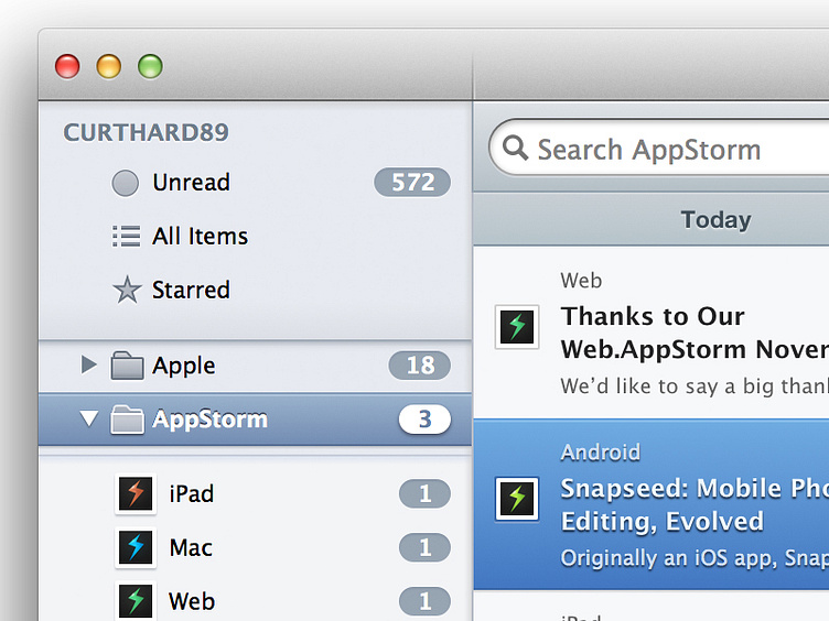
Caffeinated UI Update
Slightly tweaked UI, shadows have been changed from the large curved shadows to the straight minimal ones. Shadow has also been added to the selected source list item and the table list item. Aswell as changed the shadow on the source list selected item from being below it to being indented. What do you guys think?
More by Curtis Hard View profile
Like
