Industrial Electronic Supply logo quick fix
#3 of my personal project where I take bad logos I see around town and fix em up super quick. No strategy, no research, just cliche or a clever idea (if I'm lucky).
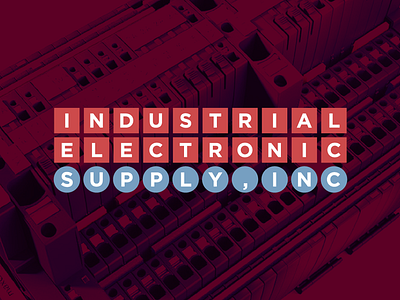
I didn't have an idea when I started this one so I simply started experimenting with type and spacing. Quickly, I realized that there was potential for a perfect 3x10 grid. This also inspired me to go for a mid-century, classic corporate branding look. I love that era of design and tend to design that way anyway.
It wasn't enough to just use the grid. I wanted there to be a reason for it. So, I skimmed their website and quickly found a product that they sell that uses similar shapes and grid layout for plugs. Good enough for me!
Full write up coming soon on my site: www.russellwadlin.com