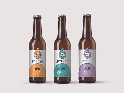
6DOTS Accessible Braille Beer Bottle Branding
The 6 DOTS Branding Concept is based on the principle that all people should be easily find a quality beer in their fridge. Using ADA-compliant Braille on the labels, means that the consumer can not only easily distinguish between a bottle of beer and a soda, but can also choose the specific brew of beer they wish to drink. With the aim of providing opportunities for meaningful employment, the company is also owned, operated and staffed by people living with low-to-no sight.
-
See more product shots at https://www.mcknightid.com/project/6-dots
-
There were many considerations that went into developing the branding for 6 DOTS. As a company that focuses its efforts on accessibility, we first wanted to ensure compliance with ADA recommendations for the use of Braille, which includes dot height and diameter sizing, cell spacing, and padding. Working from this baseline, we began drafting logo concepts that would be both high-contrast, and thus more easily read for those with low-sight, but also could incorporate Braille at an appropriate scale. We also chose to use a recognized ADA-compliant font as the primary typeface for the brand to ensure better readability.
Navy-on-white were chosen as the main branding colours for its high contrast ratio (15.42:1). Each of the secondary colours were chosen to complement the colour of the golden beer bottles, as well as their contrast ratios to navy, white and to each other. A modern, minimalist aesthetic - which is not typical of the industry - was chosen for the branding in an effort to have the bottles be easily recognizable for consumers on a shelf among a sea of other beer brands.
