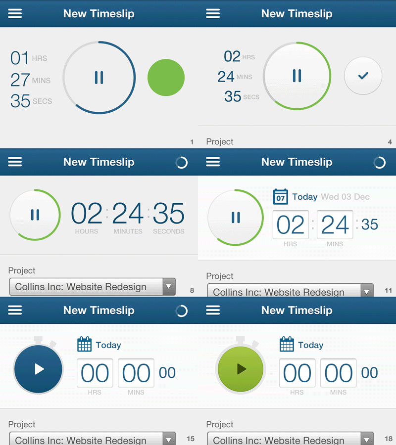
GIF of Mobile Time Tracking design progress
Design progress for the 'New Timeslip' section of Time Tracking in the mobile web version of FreeAgent. Whether you want to manually create a timeslip, or you want to use our in-built timer, this is where you come. Frames 17 and 18 are my current active and inactive timer states, respectively.
In the 'desktop' view of the app, the timeslip form comprises:
* Project (dropdown) * Task (dropdown) * User (dropdown) * Hours (text input) * Comment (text input)
As of frame 10, the hours and minutes values were made editable so we can avoid duplicating the time entry text inputs inside the fieldset.
Placing the date next to the recorded time means the two most immediate elements—the time I'm recording and when I'm recording it—are the first things I encounter when creating a timeslip. Only then do I have to deal with selecting the project, task and including a comment. Tapping the calendar icon or the current date reveals a calendar widget.
Does the stopwatch metaphor feel a bit much to you? The progress bar circling around it take 1 minute to complete a cycle. Any feedback welcome.
