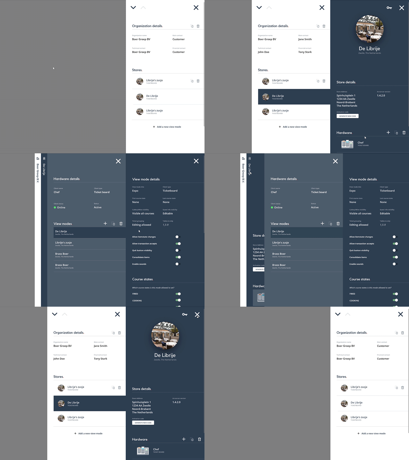
Multiple side drawers
Imagine, you've come up with a master-detail layout, for which you've chosen a side drawer construction in order to maintain an overview of the underlying master page. If you're stepping through detail items on a master-detail page, the strength lies in always seeing where you come from (as well as which item is highlighted).
Also imagine you've got many connected entities, so there will be a couple of consecutive master-detail constructions. The strength of the side drawer is being able to see the origin of your navigation, which was something that I wanted to retain. Next to that: opening side drawer after side drawer allows the user to edit content in context, rather than navigating to a different page.
But multiple side drawers would eventually hide the origin, because at some point you're going to run out of screen real estate.
That is why I came up with a collapsing side drawer design. You can see where you've come from, as well as the underlying origin. Simultaneously, you can navigate much deeper without running out of screen space.
Lastly, I came up with a design that is more responsive; on smaller screens (tablet), you'll end up with only a single drawer open at a time, rather than two at a time. On mobile, you'll get a full-size drawer to prevent clutter. On smaller screens you just focus on the context that you're actually editing, rather than the complete picture.
