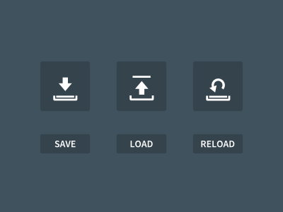
Save / Load / Reset
This is in a reply to The New Save Icon shot by @Maximilian Larsson. See there for details.
--
I would do something like this.
The Load icon needs some work, but the Save I think is pretty neat and it looks usable as is. It basically shows something being put in a right place.
An obvious option for Load is to just flip the arrow in Save, but this won't work because both icons would differ in minute details and therefore would look the same at a glance.
The Escape/Reset/Reload icon is a bonus. As I said before I don't think it's that common of an icon, but it's pretty easy to piggy-back on an Undo metaphor and extend the Save/Load visuals. The shape of the Undo arrow can also be interpreted as back to back Load and Save actions, so this might be a bonus.

