Project #27
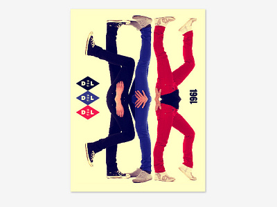
When I bought my first pair of DL1961 jeans three years ago, I felt that the quality of the product wasn't adequately represented in the brand's identity. So for this week's project I redesigned DL1961's brand, which includes their stationary, a lookbook, postcards, and website. I chose a diamond shape for the logo to represent the "4-way stretch" concept that DL1961 uses as a key selling point. All photography and graphics are mirrored to put the focus back on the jeans, where it should be. Lastly, the use of multiple colors reflects the variety of choices DL1961 has in their product lines. The overall result is a fun, quirky and effective portrayal of a great jean company.
Check out all the collateral here: http://DaydreamsandNightschemes.com/Project-27
