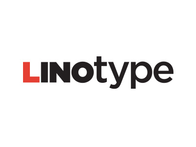
Linotype Logo
Decided to get on the play offs. Every designer knows Linotype and I opened it this morning and decided to take a quick 10 minutes to take a stab at it.
Their logo is playful and a bit all over the place. I thought to clean it up by giving it a nice baseline, leaving a bit of playfulness, and incorporating the icon into the wordmark.
Original logo: http://j.mp/Sqd4uz
More by Harry Olson View profile
Like

