Checkout - Idea Exploration - Daily UI
Hello friends!
if you haven't seen my previous project of #dailyUI #1:
https://dribbble.com/shots/8354196-Sign-up-form-Idea-Exploration-Daily-UI
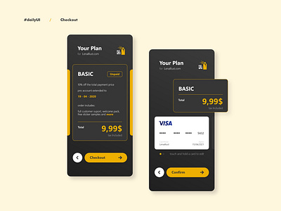
This one was tricky. I wanted to make a continuation for the previous shot, but on a different device. The hardest part was to understand that although this is one flow, it is split into two separate screens. It took me more time to understand this than I'd like to, but I'm happy with the result.
Also following the advice given to me by @415agency trying to take care of the overall look. I changed the main icon, not diametrically, because it is important for me to communicate exactly what I want, but enough for the change to be adequate and - in my opinion - more coherent.
As I decided. To make as much as possible from a task I gave my self a 1h window.
20 min. of research / sketching
(this time it was almost 40 min.)
40 (+-) min. of design
This is second weeks Checkout.
Cheers!
----
Share the love - press (L)
