Santander App redesign concept- New investment
Hola Dribbblers,
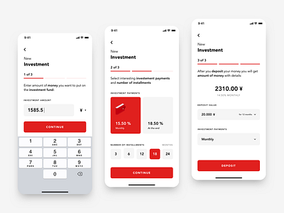
I want to present you my concept of making new investment in my redesign of Santander App. I wanted to make this process engaging for user so I divided it into 3 steps.
First step includes entering amount of investment and selecting currency so after user enter to this step he immidietaly gets opportunity to enter value without unnecessary interaction cost.
In second step user selects investment payments and number of instalments. Selected options are definitely highlighted and after user choose one of them other unselects.
The last step is kind of summary where user can preview what he selected before and how much will he earn from this investment. Some of the options are still editable at this point.
More by Bartek Gadzina View profile
Like


