Breadcrumbs
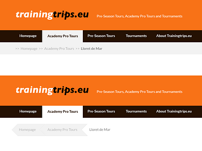
Looking for feedback, which do you prefer? The breadcrumbs in the first header blend in better into the background, taking less focus from the main content.
The bottom one - I thinks - convey the message a little more clearly (‘if you click me you can go back a step’) but the eye jumps to it before it gets to the content. And I'm actually not sure if that's a bad thing, or rather potentially a good thing.
The audience is not all that tech savvy.
More by Babs Gösgens View profile
Like
