Basis logo process
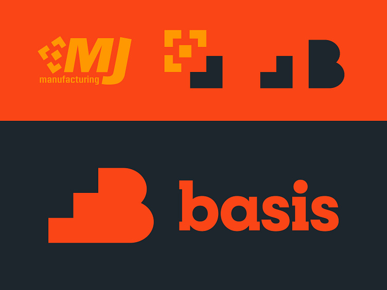
When creating the branding for our new company, Basis, we found inspiration in our existing family business. The definition of ‘basis’ is the base of something considered as its foundation or cornerstone. As it just so happens, our family business’ logo, which I designed more than a decade earlier, utilized a geometric pattern that takes the shape of a cornerstone. This became the logical starting point for the Basis icon.
Our work at Basis is built on a foundation of creativity and craftsmanship. The look of our brand needed to balance the abstract nature of the creative process with the precision of fabrication. The sharp edges of the cornerstone shape blending into the curves of the "B" does exactly this. A wordmark, derived from the typeface Breton, gives the logo a look that balances art and industry.
When I designed the MJ logo 13 years ago, I never anticipated that my choice to leave the icon minus one corner piece would serve to be useful in the future. Sometimes the best ideas come about by accident or perhaps destiny.