Which one?
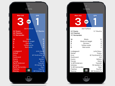
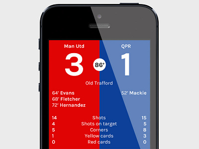
After trying a few options, these are the two I need to choose between. The original idea was the one on the left with the colours of the teams dominating the screen, but for readability the white version may be better.
Also, with a white team like Spurs, the centred text will get lost in the full-colour option.
What do you think?
More by Dan Rowden View profile
Like

