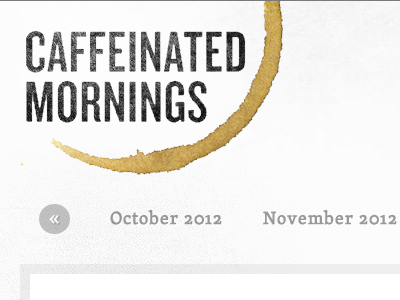
Caffeinated Mornings — Actual
Drawing the logo didn't end up working—the letters were feeling too chunky and misshapen when paired with the organic coffee stain image.
For this logo, I ended up going with trusty ol' Trade Gothic. I think that it is very close to what I originally had in mind, and it just feels more legible and useful.
More by Andy Stone View profile
Like
