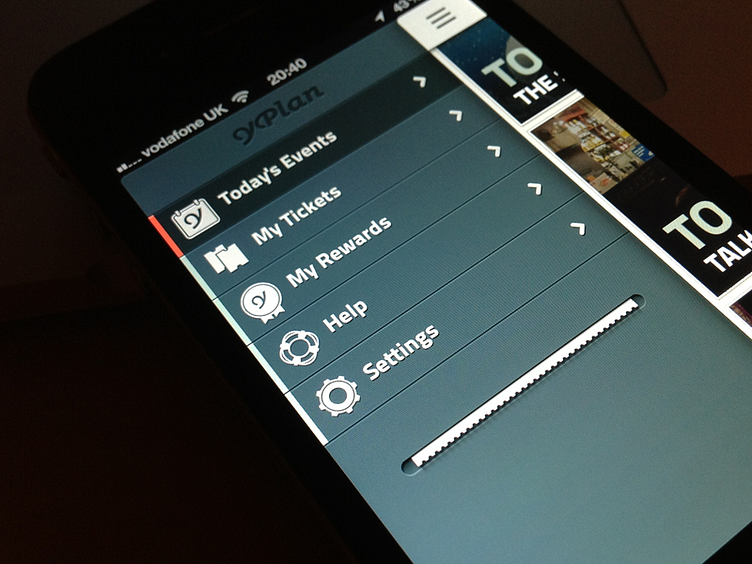
YPlan app side menu
This is the solution i found for the side menu which becomes part of the booking process. When you book a ticket, the menu opens and prints the little ticket coming out of that hole. It stays there as a reminder until the date of the event.
I designed the icons taking in consideration the brand language. Not sure if i should keep the Y on the first one for the calendar, considering i'm also using it for the 'my rewards' section. What are your thoughts on this?
The animation can be seen here http://vimeo.com/54194401
You can check it @2x here
The app can be downloaded here http://bit.ly/ULk6Kl
More by João Pires View profile
Like
