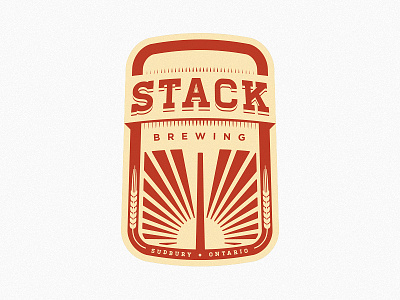
Help me enforce good design.
THE SHORT STORY
I want my local brewery to have an awesome logo & labels. They might be stuck to their current design, and I want to convince them otherwise. Help me revise it into something everyone will love.
THE LONG STORY
I live in a city which has been brewer-less for over a decade. A new one is sprouting up and I've taken it upon myself to ensure they have a good clean logo which will certainly lead to a good clean label and packaging.
The problem is this: I've shown my rendition of the logo compared to their current logo which has been quickly brewed up (pun intended). My designer friends chose mine. My non-designer friends chose the other because it had more "punch". The client is going to do the same.
I need your input (and rebounds!) to ensure that the client will choose a well designed logo, and that the local craft beers are saved from bad kerning and smoke stacks that look like canons.
Rationale: my city is home to the world's most resourceful nickel refinery and thus has a giant smokestack on the horizon. Google: sudbury smoke stack.
I'll super appreciate any feedback / rebounds / comments. Be nasty.

