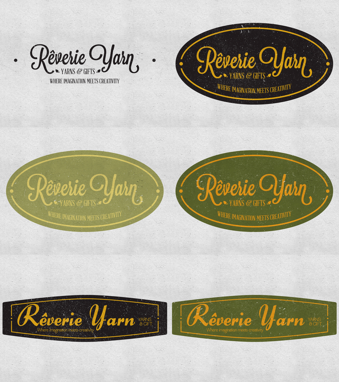
Rêverie Yarn branding - Revision 03
These are the revised branding options we submitted after our first round of concepts was shot down. They wanted to refocus on a "French antiques" feel.
The typefaces used are Lavenderia Sturdy, Abraham Lincoln, Quaver, and Forelle.
We're fans of the single rim ovals. And yes, there's a spacing issue on the second concept between the inner rim and the type. The containing shapes are meant to also be the shape the sign of the store would be made in.
More by Simon Hartmann View profile
Like

