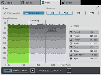
AMA time series
This is one screen of the AMA prototype. My intention was to keep it simple, well-ordered and easy too use. The challenge was clearly to get everything in the 800x600 px border while keeping single touch usability. Got the clients's wireframe and was responsible for the GUI. Colors are a bit different from the original display. Make sure u click on @2x !
More by Florian (Fritz) Friesinger View profile
Like
