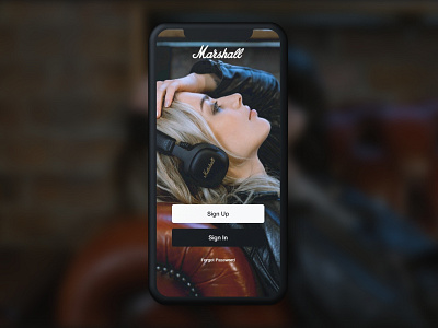
Marshall Headphones Sign Up page
A quick half hour project designing what a Marshall log In page might look like. I did brief research gathering branding elements from their website; fonts, color and imagery. The goal was to make it work within their current design system as seen on marshallheadphones.com. I iterated a handful of versions before finally settling on this look. Clean Marshall off-black and white buttons, slightly rounded edges like their speaker line, with soft drop shadows to help slightly lift them off the page.
More by Kevin Lanuk View profile
Like
