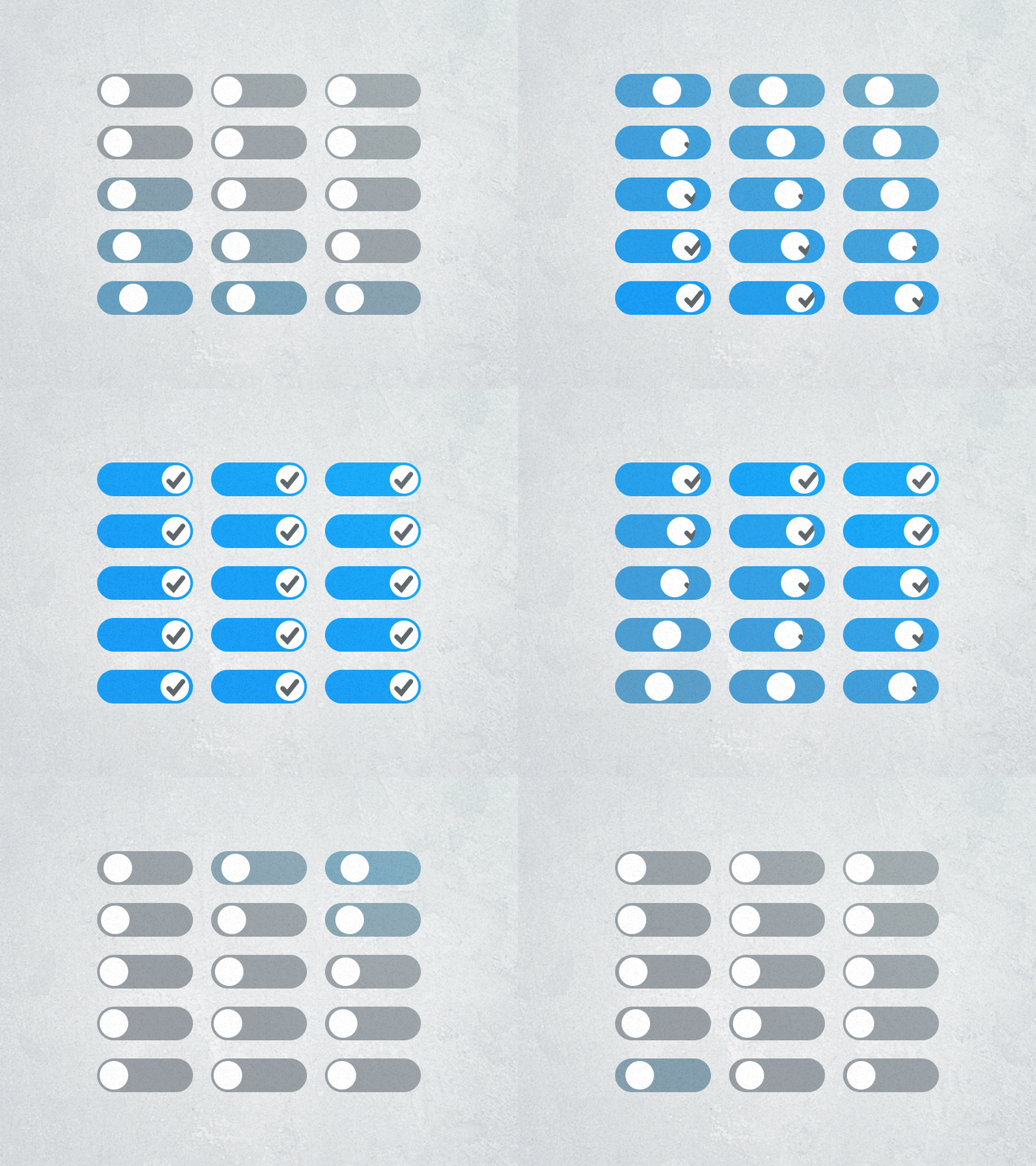
iOS Switch Concept
I like iOS’s switches, but I don’t like that they include text for ON and OFF (or I and O). Switches are essentially check boxes, so why not use a tick instead of ON?
Q: Why are there lots of switches, instead of just one? A: Because life is more fun with friends.
––––––––––––––––––––––––––––––––––––––––––––––––––––
Update: Adam Bell (@b3ll) has built it! http://youtu.be/hZETYwBUYH8
More by Marc Edwards ✎ Bjango View profile
Like
