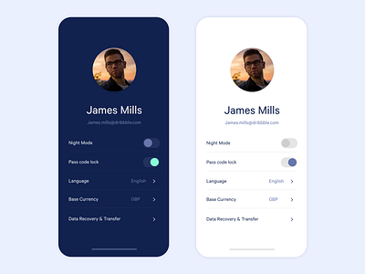
Profile UI/Colour Exploration
This Daily UI is a little late! i took the profile brief and decided to take it a little further and do some colour exploration looking at the difference between a dark mode and light mode.
I can't decided which i like best, the light mode looks cleaner but the dark mode i feel the information it is showing is a lot easier to read.
let me know what you think :)
More by James Mills View profile
Like
