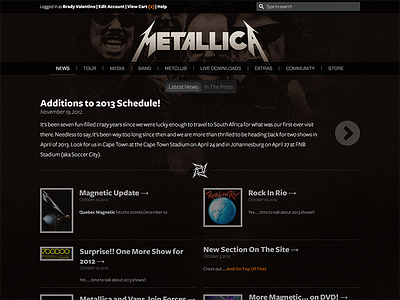
Unsolicited Redesign: Metallica.com
As a frequent visitor to metallica.com I'm constantly bothered by the outdated and, frankly, ugly website that I'm presented with. You're given the ability to choose from a number of themes, each based on an album from Metallica's discography, but all they do is change the colour scheme of the website.
I don't believe the layout of the website has changed at all in the last 10 years. It's fixed width to about 800px, which leaves **a lot** of dead space on my 27" display.
I redesigned the homepage with a responsive layout in mind. I kept all the same elements that are on the current website, and they were either moved around and or given a 21st century facelift.
Here's to hoping that some day soon the actual website gets a well deserved update.

