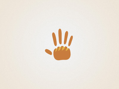
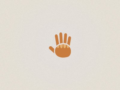
Logo concept 2
Ok guys,here's the changed version of the logo. Since I want it to reflect that the bread is handmade,I've made all the shapes by hand and everything was drawn separately.It's a little uneven and looks more like a hand print but that was the idea and I think it's an improvement :) I've also made the bread more recognizable (hopefully) What do you think about it?
More by Vanja Blajic View profile
Like

