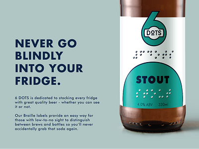
6DOTS Accessible Branding & Ad Campaign
The 6 DOTS Branding Concept is based on the principle that all people should be easily find a quality beer in their fridge. Using ADA-compliant Braille on the labels, means that the consumer can not only easily distinguish between a bottle of beer and a soda, but can also choose the specific brew of beer they wish to drink. With the aim of providing opportunities for meaningful employment, the company is also owned, operated and staffed by people living with low-to-no sight.
-
See more project photos at https://www.mcknightid.com/project/6-dots
-
There were many considerations that went into developing the branding for 6 DOTS. As a company that focuses its efforts on accessibility, we first wanted to ensure compliance with ADA recommendations for the use of Braille, which includes dot height and diameter sizing, cell spacing, and padding. Working from this baseline, we began drafting logo concepts that would be both high-contrast, and thus more easily read for those with low-sight, but also could incorporate Braille at an appropriate scale. We also chose to use a recognized ADA-compliant font as the primary typeface for the brand to ensure better readability.
In an effort to educate consumers about the importance of having accessible products in mainstream markets, an Ad Campaign was developed highlighting both the compassionate production that goes into making the beer, but also the common problem of non-recognition that many people with low-to-no sight may experience in trying to distinguish between products at home and in the marketplace.
