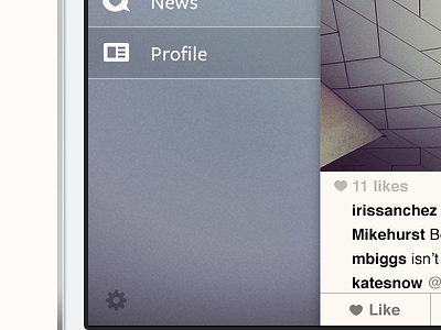
Full sidebar - Instagram concept
It took me very long to get the colour of this layer right. It's actually inspired by the background of Paper and the album art of this CD by Jack Johnson. It reminds me a bit of a washed jean, a texture that was used for the first version of Instagram. Because the elements on this layer are very minimalistic, it doesn't get cluttered.
More by Joost van der Ree View profile
Like

