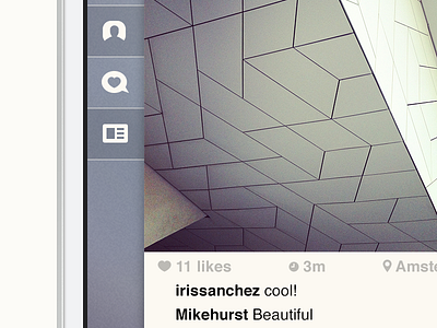
Sidebar - Instagram concept
The sidebar and the navigation bar is actually one piece. The 'content' layer moves over the blue background. It emphasises the simplicity of the app. The lower (blue) layer is a very flat one. The text and icons don't have any shadows or gradients.
Check out the attachment to see the full view.
More by Joost van der Ree View profile
Like

