App Icon
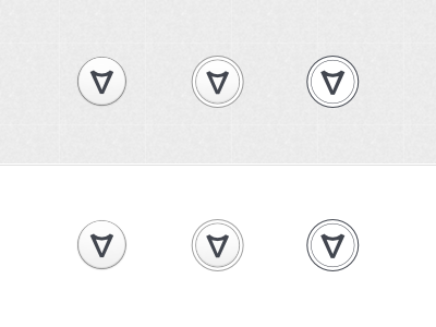
I really like the one on the right, but it just sticks out like a sore thumb in all the gloss and gradient galore of Aero. So I'm thinking the one in the middle...
I really like the one on the right, but it just sticks out like a sore thumb in all the gloss and gradient galore of Aero. So I'm thinking the one in the middle...
