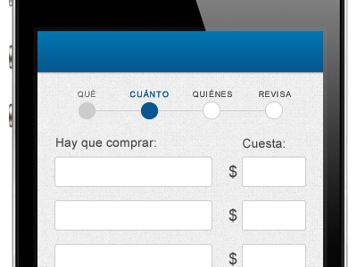
Wizard Progress
Visual design is not my thing. I'm more comfortable with designing on a browser with good old html + css. But I'm giving it a try here. Nothing fancy, as you see.
I need to show progress and how many steps are left to complete the flow. It's a challenge for a mobile interface, with so little space to spare.
Still not sure about colors or typography... like I said, I'm a code girl.
More by Nati Devalle View profile
Like
