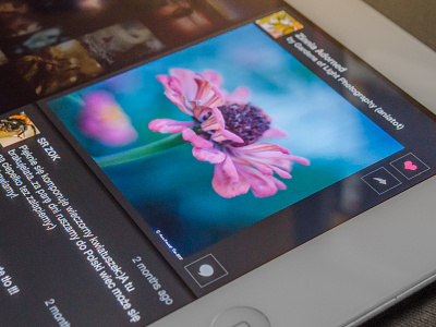
Detail panel
Live preview from the app.
I initially went with a ivory color for this panel. But then I realized the photos were getting lost amongst the text. The darker panel however restored that balance IMO. What do you think? Any suggestions?
More by Nikhil Nigade View profile
Like

