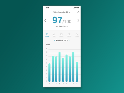
Analytics Chart - Daily UI 18
For this challenge, the theme was to create an analytics chart. I chose to create one for a sleep/CPAP app. I wanted to make sure that the sleep score was the most prominent piece of information since that would help the user understand how well they slept. I also added icons above the graph area so that the user can quickly switch between the different graph types. If I had to do it again, I would add more visual elements to the sleep score to possibly add more attention to it and make it more visually appealing. If you like what you see, please hit the like button and don't forget to follow if you would like to see more posts like this. I appreciate the love and thank you for checking out my posts!
More by Jimmy Diep View profile
Like
