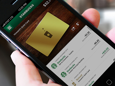
Starbucks Reloaded – Card
An additional screen for my Starbucks mobile app redesign. Per my previous post, the current UI has far outgrown its current feature set (nor is it optimized for the iPhone 5).
I always felt it would be nice to see a purchase history on the card screen itself. Please be sure to check out the 2x view and the attachment.
Interested in hearing your feedback.
** NOTE: This is not affiliated with Starbucks.
More by Daniel Filler View profile
Like

