Client logo
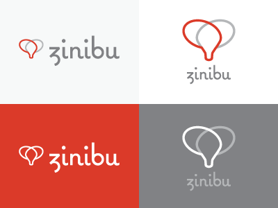
Hard to represent "knowledge sharing" without resorting to obvious visual metaphors. Hopefully this take is sufficiently unique, cause it's the one we're going with. The font is a slightly modified Coquette from Mark Simonson; the lowercase b was a bit too frilly.