CRM: Landing page
Hi, friends
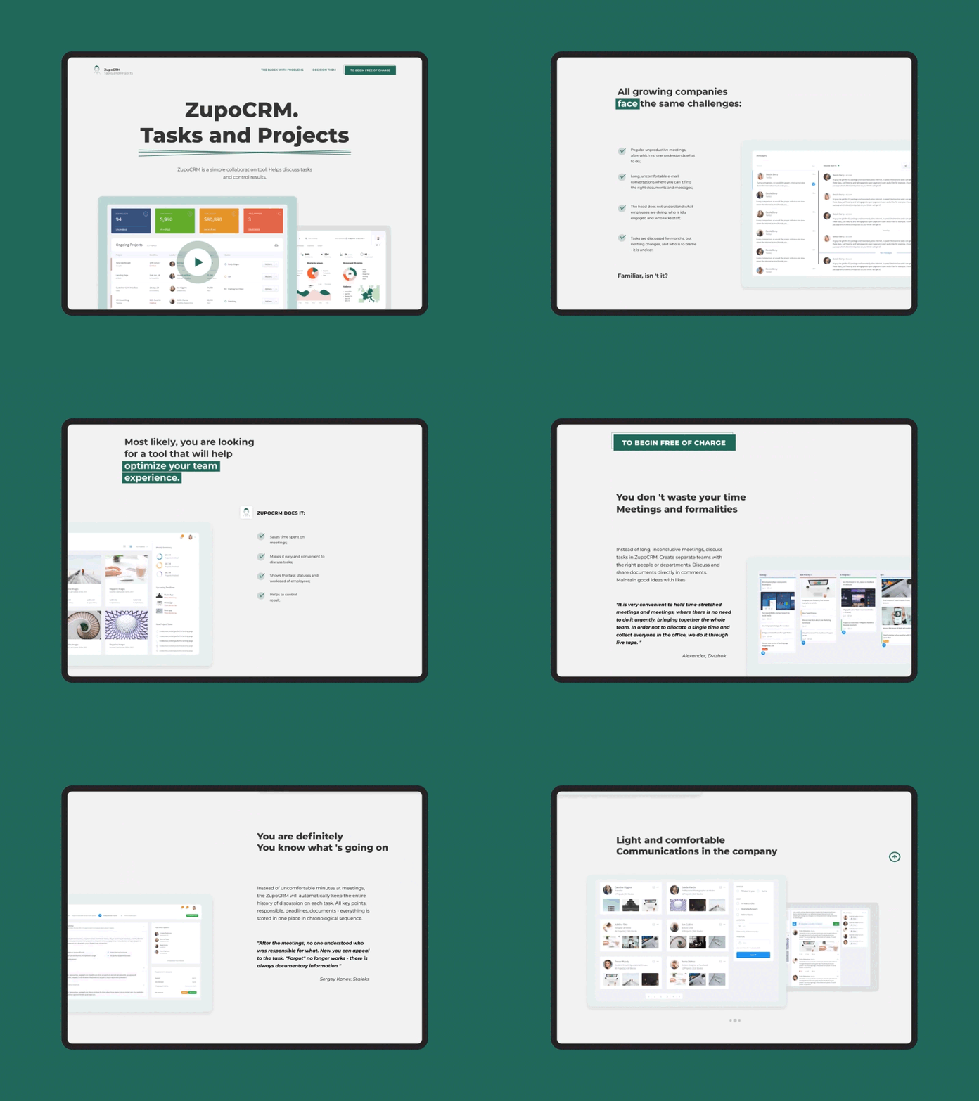
The landing page is made in minimalist style, it has a lot of empty space, which gives it its ease. Text content is broken down into paragraphs listing "a block with problems and solving them." Each paragraph is provided with a title that is revealed in detail in the text content of magnitude, and accompanying screenshots will help the reader carry a sense load.
Press "L" to appreciate it
***
Eager to hear your thoughts and comments!
More by Yevhenii Kulyk View profile
Like
