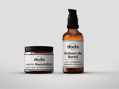
Doda Natural Cosmetics - packaging
Here are some mock-ups of the packaging I created for this brand.
I organised and colour coded the product range according to usage: pastel green for bath & cleansing products, warm grey for utilitarian products (like herbal remedies for skin & hair care), light coral for skin creams & lotions.
Because each product has different care effects conferred by the plants & herbs in its composition, I felt it was important to highlight those effects on the front of the label.
More by Diana Cristea View profile
Like
