Share dialog tinkering
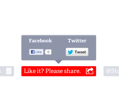
I wanted a way to hide share utility (and lazy load all their slow JS). Once a user clicks the big button (red is just temporary active/enabled state but I'm starting to like it -- it's a lighter gray by default), the popup does a little fade in drop. Originally thought about making each Facebook/Twitter side their respective blues but that kind of messed up the palette on my site.
The good thing about this is I also lazy load all their slow JS.
Edit: the final version gets rid of that middle divider. And the active/selected state of the main button is a dark gray not red. And I'm now using the smaller twitter button --same size as FB
More by Paul View profile
Like
