Personal Site Facelift
I have been noodling on how the next iteration of my blog should look/feel/behave. I built my website, http://www.whitespase.com, using some cowboy coding and live in-the-browser design a couple of months ago.
Now I am coming back with a sharper eye and fine-tuning my own personal brand, adding my portfolio, and trying out some new things that aren't quite ready for client work yet.
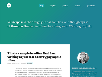
This is my first sketch, a murkier, yet more bold approach to my already subtle colors. The current design is minimal and washed out (in a good way) and I knew from the beginning that the next iteration would be darker, deeper, and more contrasty.
I'll be giving sneak peeks along the way as I flesh out some of the UI details.
Comments and critiques are welcome!
Check out the full pixels in the shot.

