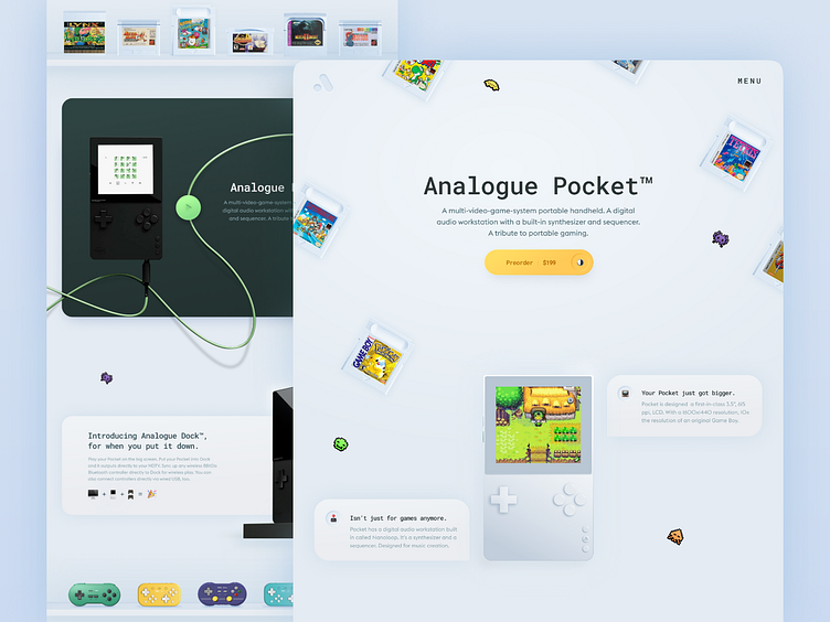
Analogue Pocket landing
Hi fellas!
I got a little carried away with the subject of skeuomorphism and continued the theme of the previous shot. I wanted to redesign the style of the landing page and present the product more vividly. In my work, I wanted to make unobtrusive volume, depth of interface objects and cleanliness. As always, I wanted to make colors brighter. More material can be seen on my Behance I hope you will enjoy!
Have a project for me? Send me message
More by Toma View profile
Like

