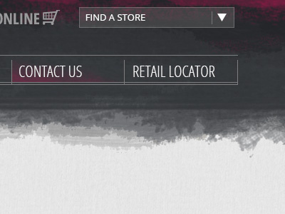
Grungy - Header
the client wanted more pink "grunge" in the header... also sorta worked on the hover state in the nav... feedback appreciated.
this site is for a african-american hair product sold in stores like walgreens/walmart...
More by Shannon Rhodes View profile
Like
