GoldCoast Cycles Logo Rationale
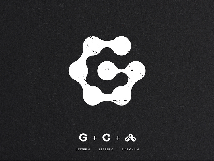
Logo design concept for Aussie, Gold Coast based bike shop, ‘GoldCoast Cycles’ 🚵♀️ Running with an obvious bicycle theme I used the shape of a segment of bike chain to form a capital letter ‘G for Gold’. The negative space left in the middle of the shape creates a ‘C’ for Coast.