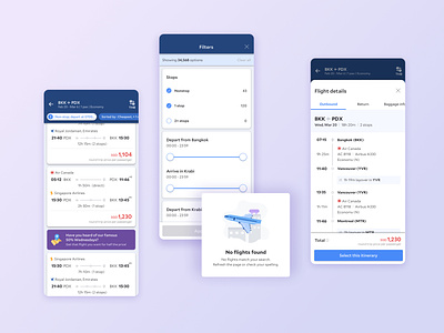
Flight app search results
A single search query can populate hundreds of results. Do we offer enough ways to skim the content so a user can quickly find what they want? Within the search card, do elements such as typography and colour help users scan information effectively and efficiently, based on what research has shown to be their most important factors when booking a flight?
This is still ongoing and we've only just shipped the MVP in July this year so there's lots of work to do!
You can download the app (and maybe book a flight while you're at it) here
More by Danielle Liu View profile
Like
