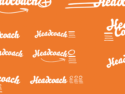
Headcoach logo drafts
So I'm making a thing. It's a scheduling app for people that want to spend their time doing the work, instead of planning it. Will be adding more shots to the project soon.
Here's some ideas for a logo, I haven't really decided on anything yet, but the direction I'm going obviously plays on sports related stuff. My main issue is that I think the uneven/jagged look of the drawings clash with the "cleanliness" of the type.
The figure in the logo is supposed to resemble the lists of shifts & people in the app (see this shot) and formations/plays, as a coach would draw them on those whiteboard-thingies.
I also toyed around with an idea of using the screen play as a smiley face, which you can see in the lower left of the full image. But it might be a little forced...
What do you think? Feedback is, as always, greatly appreciated.

