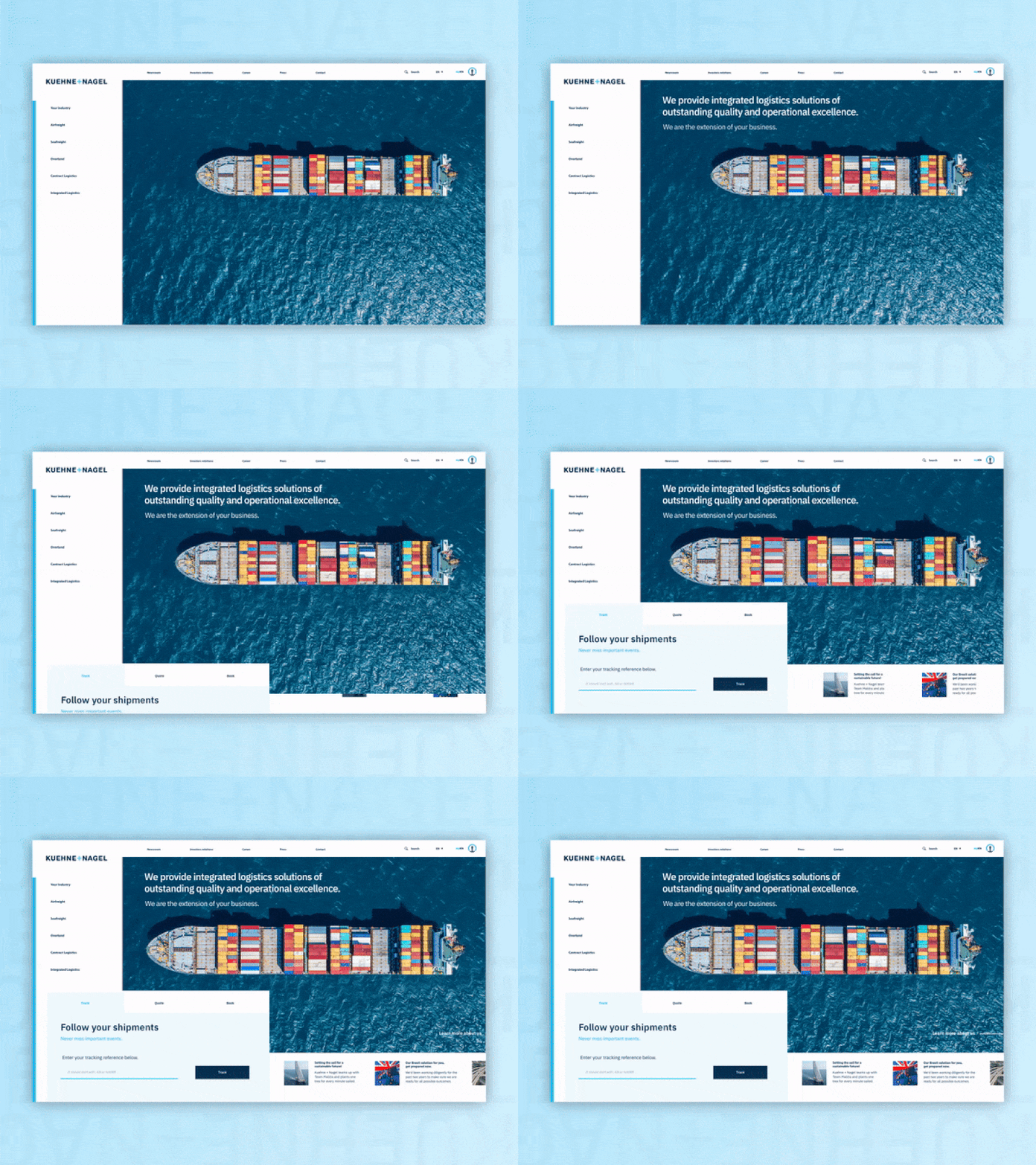
Redesign Kuehne+Nagel website with transitions GIF.
Last time I made a redesign of the website of Kuehne+Nagel as concept. This time I also wanted to share the transitions I've made. I had much fun designing this, unfortunately I had to compress the GIF file so it's a bit blurry.
More by Tai Tang View profile
Like
