Dribbble Work Display Page Design

Dribbble reimagined. Had some good fun with this redesign challenge.
*Watch the whole prototype in action here - https://www.linkedin.com/posts/fak_uxdesign-uidesign-dribbble-activity-6600385854802362368-JGGm *
Why I like this interface?
- Less traffic on the main work display. A lot of wordings and links have been removed.
- Not having to swipe down, the comment section is just one click away.
- The sharing button is also just one click away and is easily findable.
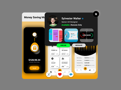
- The user profile is again just a click away. From who that person is to his/her profession to his/her availability with the ability to view their works and hire or message them, all in one.
- Clean and easy to use
- Clearly state which software that made this design possible. I feel like this is really important for both inspirations and job offers.
Connect with me:
- FFRDM.com
- info@ffrdm.com
- LinkedIn.com/FAK
- Behance.net/IAMFAK
Thank you for viewing my work. Have a great day :)