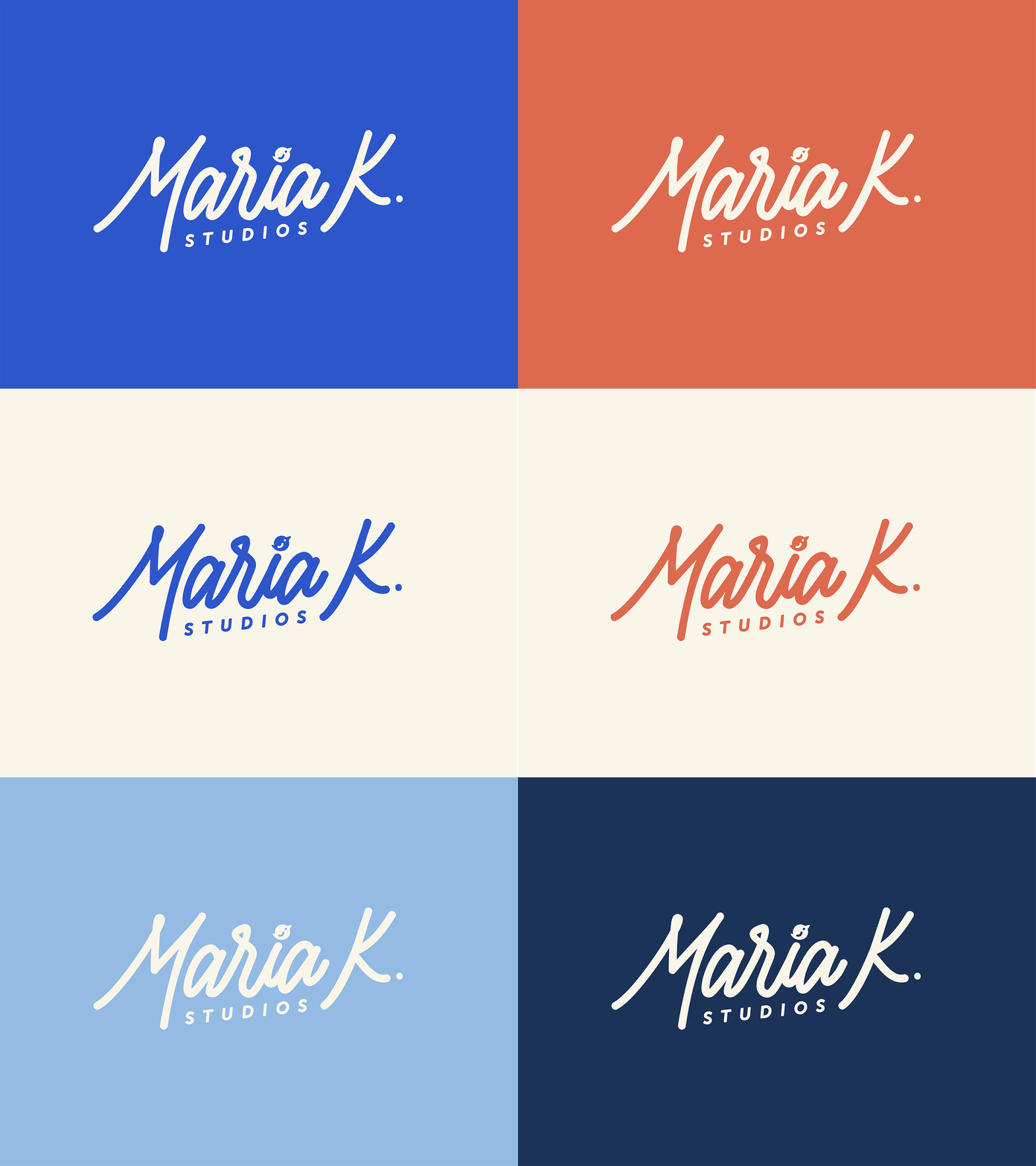
Studio Rebrand
This past month I decided to do a rebrand of my freelance studio. My old brand didn't feel connected to my work style or personality. But I wanted to keep the same theme using bird icons so that I wasn't tasked with creating a new mission statement and brand language.
"Maria K. Studios seeks to provide clients with a full spectrum of design products and style options to help companies take flight in their respective markets."
My goal was to design a more dynamic logo that visually represents the ideas in my mission statement. I specialize in layout design, branding, illustration, and lettering, and I needed an identity that represented my style without being specific to only one service I provide. My font choices and the overall construction of the logo stem from minimal designs I've seen over the years for outdoor themed logos, stamps, and prints, with a color palette inspired by the Eastern Bluebird.
My new brand feels much more streamlined and reflective of my work and ideas! More elements and behind the scenes coming soon!
See the rebrand in action at my upgraded site: mariakstudios.com.
