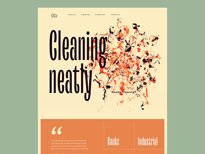
Cleaning Service Website Interactions
Another glance at our new project devoted to the theme of cleaning and comfort. Here's the set of interactions designed for the cleaning company website, and it's quite far from common for this market segment. Unusual color palette, easily readable fonts and super engaging hero animation that shares the idea of transforming chaos into the order and cleanliness. Stay tuned to see more on this project in our next shots.
Also, welcome to review our set of design tips on improving web scannability and learn about the popular types of helpful visual dividers in user interfaces.
More by tubik View profile
Services by tubik
Like
