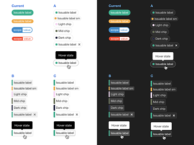
Label exploration
Working through some label exploration. These are user-generated, and users can select the color.
Current state can be very vibrant and draw more attention than desired in the context of a larger UI. Color combinations may also not meet the minimum WCAG 2.1 AA contrast ratio of 4.5:1.
Concepts consider accessibility, user-selected color, default/small sizing, and integration with a larger context in both light and dark UI.
Preference? Comments? Feedback?
More by Jeremy Elder View profile
Like


